Applebob
A Case Study
 View Prototype
It seems that everyone we know has felt the effects of the COVID-19 pandemic. While many things have been said on the topic, I noticed a gap in meeting the needs of teachers during this time. As I quarantined with my mom, a 3rd grade teacher, I noticed hours upon hours of extra time she was putting into extra meetings to try and learn about Google Hangouts or fix a broken Zoom link. In that frustration, I proposed a school-wide solution with an app that would simplify the process of having to conduct learning online.
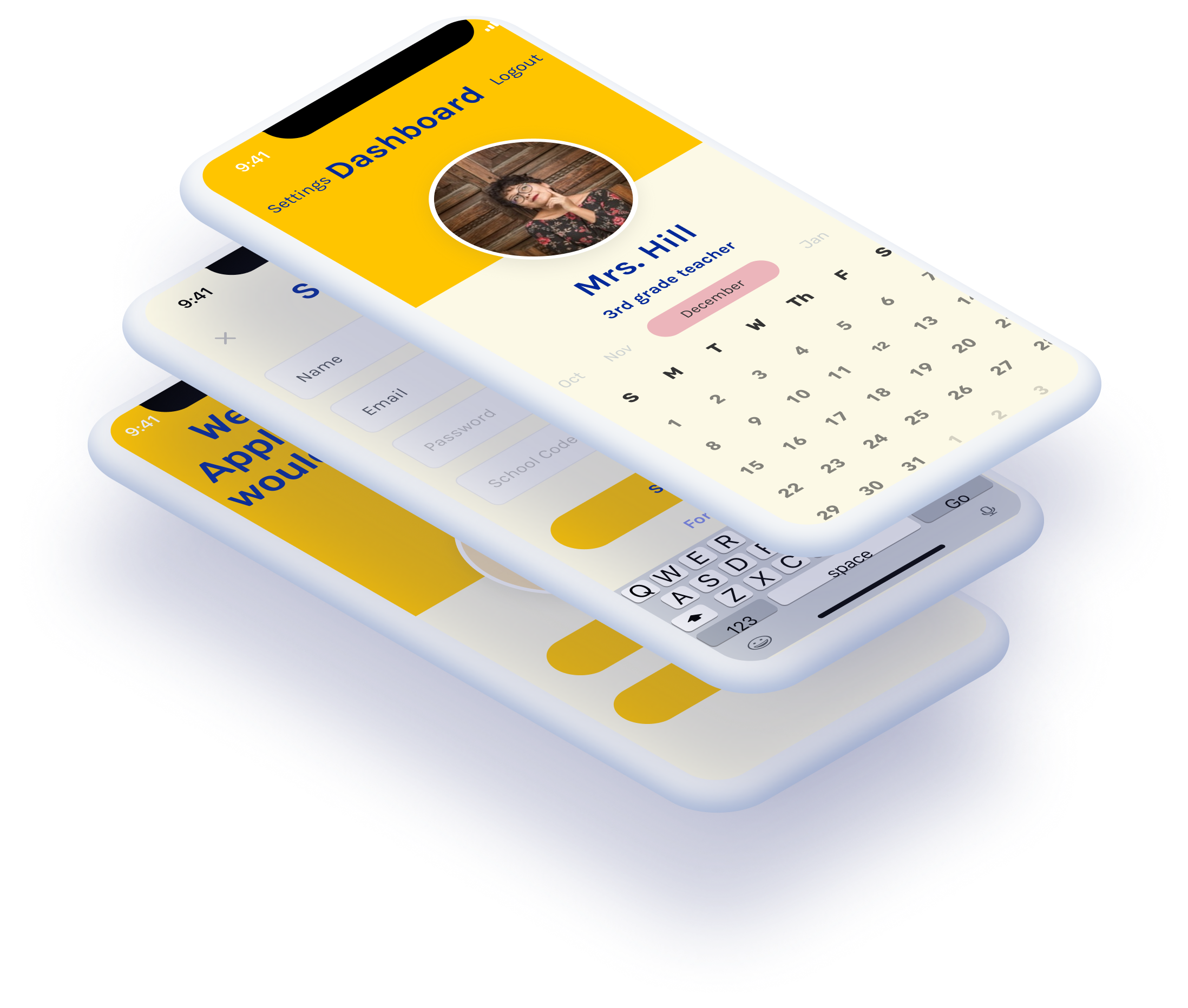
Through that thinking I attached to the idea of a simplified interface for communicating, called Applebob. I began by sitting down with my mom, along with some other teachers, to discuss the pain points that were evident in online learning and what I could fix. Ultimately, teachers wanted something that was simple and less likely to give them technical issues in their already full workloads. While they felt extra responsibilities with the pandemic, they also cared about their students and were concerned about being able to connect with them.
I worked as the solo UX designer and researcher for a rapid prototype of a proposed solution to online learning.
Elementary teachers and their students.
The COVID-19 pandemic changed the way classrooms operate, and schools were pushed to adjust to new methods.
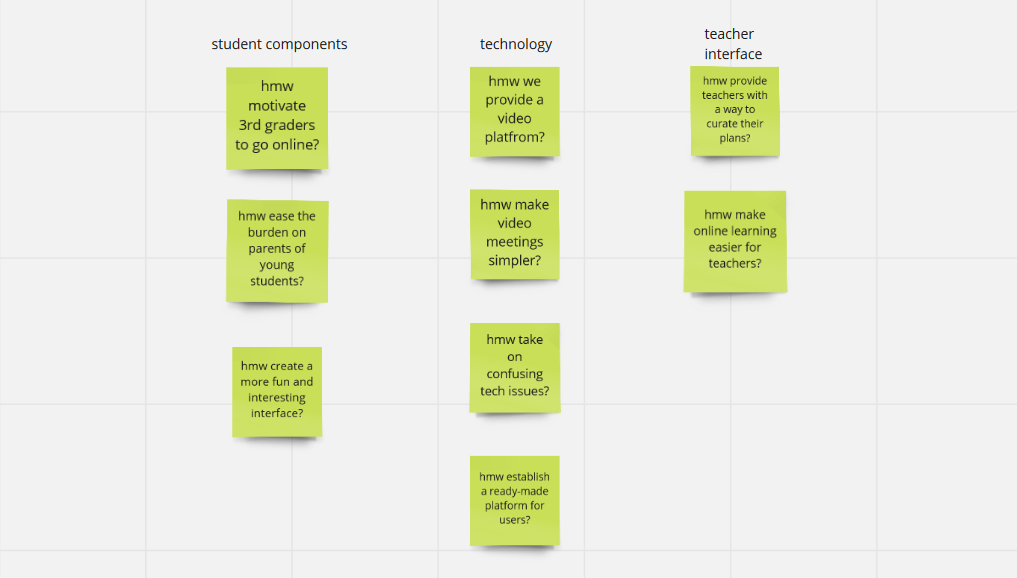
Creating an app that would allow teachers to reach students across multiple interfaces.
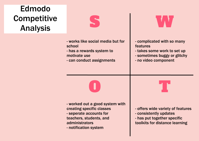
As I began to survey, I had a fairly wide array of responses. Overall satisfaction within the current methods of online teaching were widely varied. This survey in particular was based on teachers using Zoom and Google Classrooms as their learning tools. As evidenced from the survey, the platforms did not have consistent usability for all teachers. Overall, the general experience was pretty average, so there was evident room for improvement to create a more pleasing and universal interface.
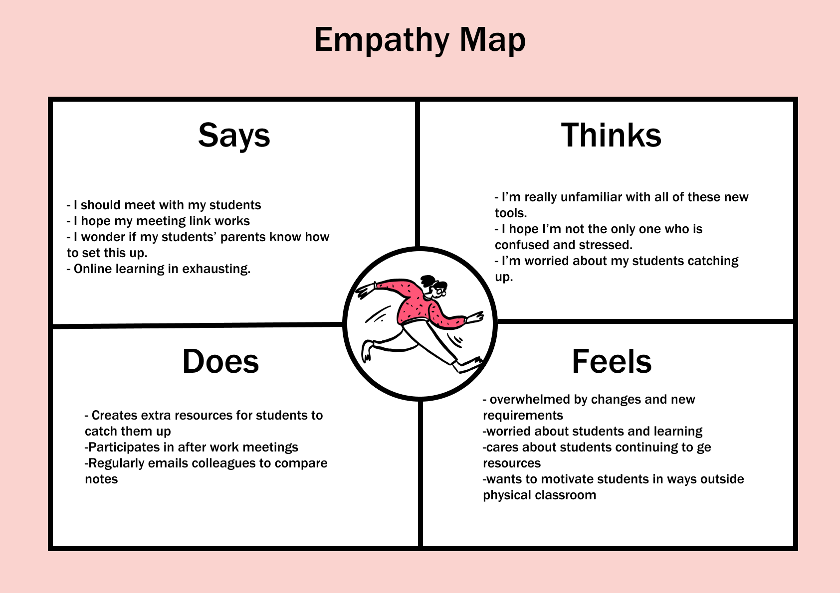
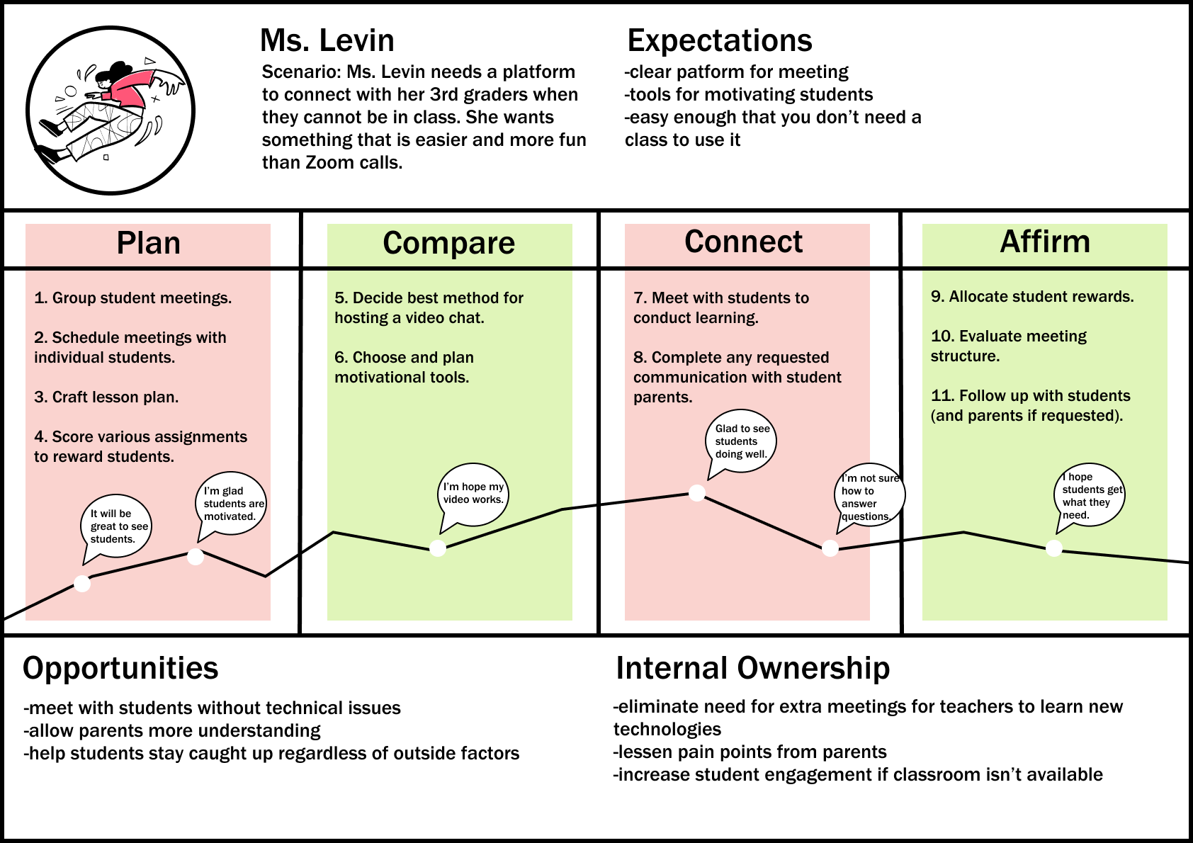
First, I used this input to create an empathy map. In order to make this program work for teachers, I needed to understand their emotions while using a hypothetical product. Through this empathy map, I reflected both the worry and exasperation that teachers were experiencing while acclimating to new teaching platforms. Next, I mapped those emotions into a proposed journey to have a visual of what the user process might look like. In this journey map, I considered what Ms. Levin may be thinking as she plans to meet with a student. In this process, she considers the best methods to connect with her students online as well as keeping their parents in the loop at home.
Occupation:
3rd grade teacher
Location:
Burnsville, MN
Age:
31
Family:
Married
Biography:
Leo recently began a new teaching job at a local elementary school. Because of COVID, Leo's class has moved online.
Needs:
-contact students and parents
-explain assignments
-distribute work online
Pain Points:
-online platforms take too much time for both students and teachers to learn
-not all students are caught up
-trouble keeping track of various Zoom calls
"I want to be sure that my students are able to access their assignments no matter where they are."
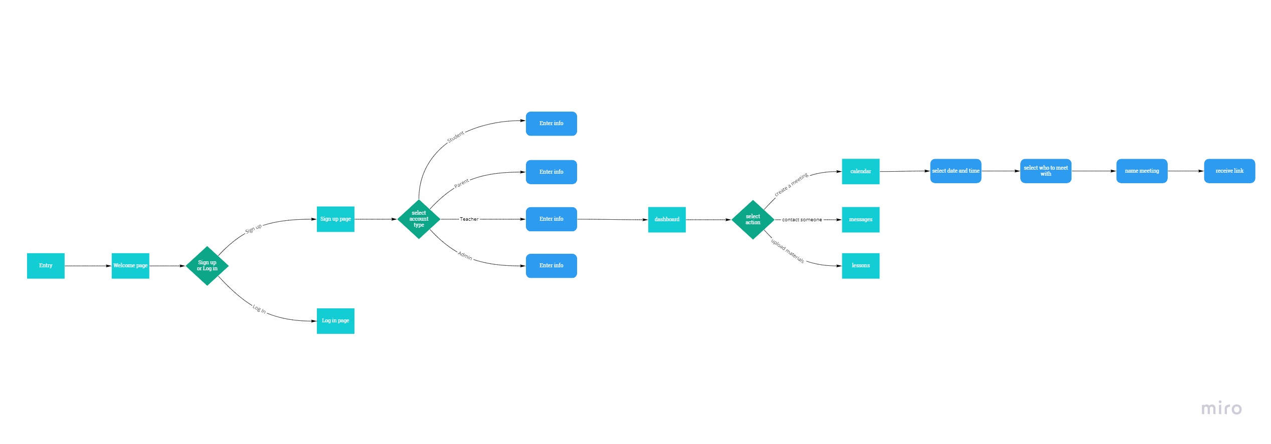
Based on the research I had done with the teachers, I created personas. My main persona that I ended up designing for was Mr. Press, an amalgamation of the general needs of the teachers I spoke with. As one teacher noted, personal connection with young students was the most important starting point for their learning, and Mr. Press represents that effort. Ultimately, I wanted to create something that would both make the lives of teachers easier and enrich their connections with their students. In my user flow, I use a proposed route that Mr. Press might take to use the app by first signing in and then conducting a meeting.
Occupation:
School Principal
Location:
Des Moines, IA
Age:
58
Family:
Widow with children
Biography:
Emery had been a principle for as long as she can remember and a teacher for even longer. With online learning becoming more prevalent, she wants to update the tools her school uses.
Needs:
-Quickly create in-services
-Receive messages from parents
-Share progress reports with teachers
Pain Points:
-complications learning video chat software
-No easy way to contact all parents
-Teachers feel left out of the loop

"I want to learn how to utilize online learning."
Next, came the product sketches.
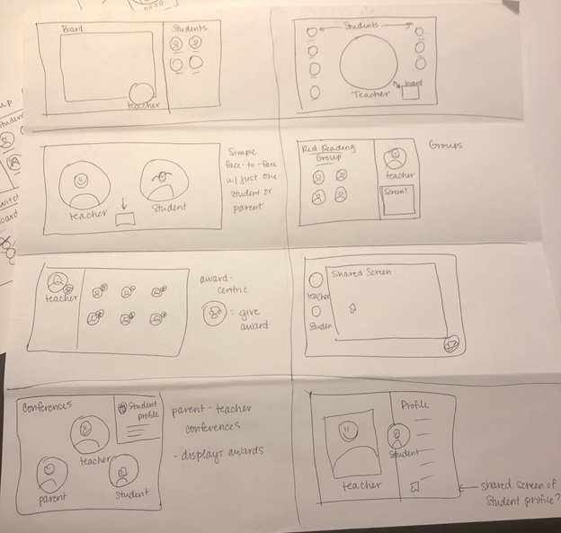
Creating sketches was essential for the design process. Because simplicity was the name of the game here, the sketches were helpful in narrowing down the components needed. Through this process I became aware of the need for separate accounts based on the user, separated as teacher, student, and parent.
From the sketches I began building wireframes in a desktop format. However, I realized that a desktop layout was not optimal for narrowing down features since I had so much space to fill. As is typical in this stage of the design process, my first designs helped me realize some changes I needed to make early on before I had to redo too many components.
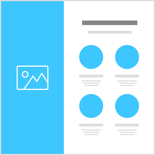
I then mapped out possible user flows to further narrow down the essential boards. Once I noted these changes, I went into creating a low fidelity prototype that would be testable. Now designing on a mobile platform using Maze, I gained extensive feedback on the functionality of the product. Aside from a few issues with button placement and scrolling, I was happy to see most of the tasks presented during testing were clear for users.
Thanks to early user testing and feedback, I was able to hash out usability issues from early on in the project. Going deeper into the analysis on Maze, however, helped me understand how real world users would navigate the app. Through this process, I learned how to shape components in my visual design to be more user friendly. For example, many of the banners of text in the prototype were the same shape as the action buttons. According to the heat map, most users thought the "Log In" banner was a button and clicked on that instead of the text box. Based on this feedback, I updated my component library to better reflect differences.
With all of my data, it was finally time to begin prototyping. After switching viewports from my wireframes, I focused on making a lo-fi prototype that would present the minimum needed to communicate the app's purpose. I felt it was important to create a lo-fi prototype before implementing my branding so I could establish the most important points in my layout.
Using these deliverables, I will continue with the visual design on this project, as well as adding more sections for various users. Many teachers noted that schools intend to implement online learning more in the future for snow days, inservices, etc, so I expect to be doing continuous usability testing as the pandemic shapes learning.